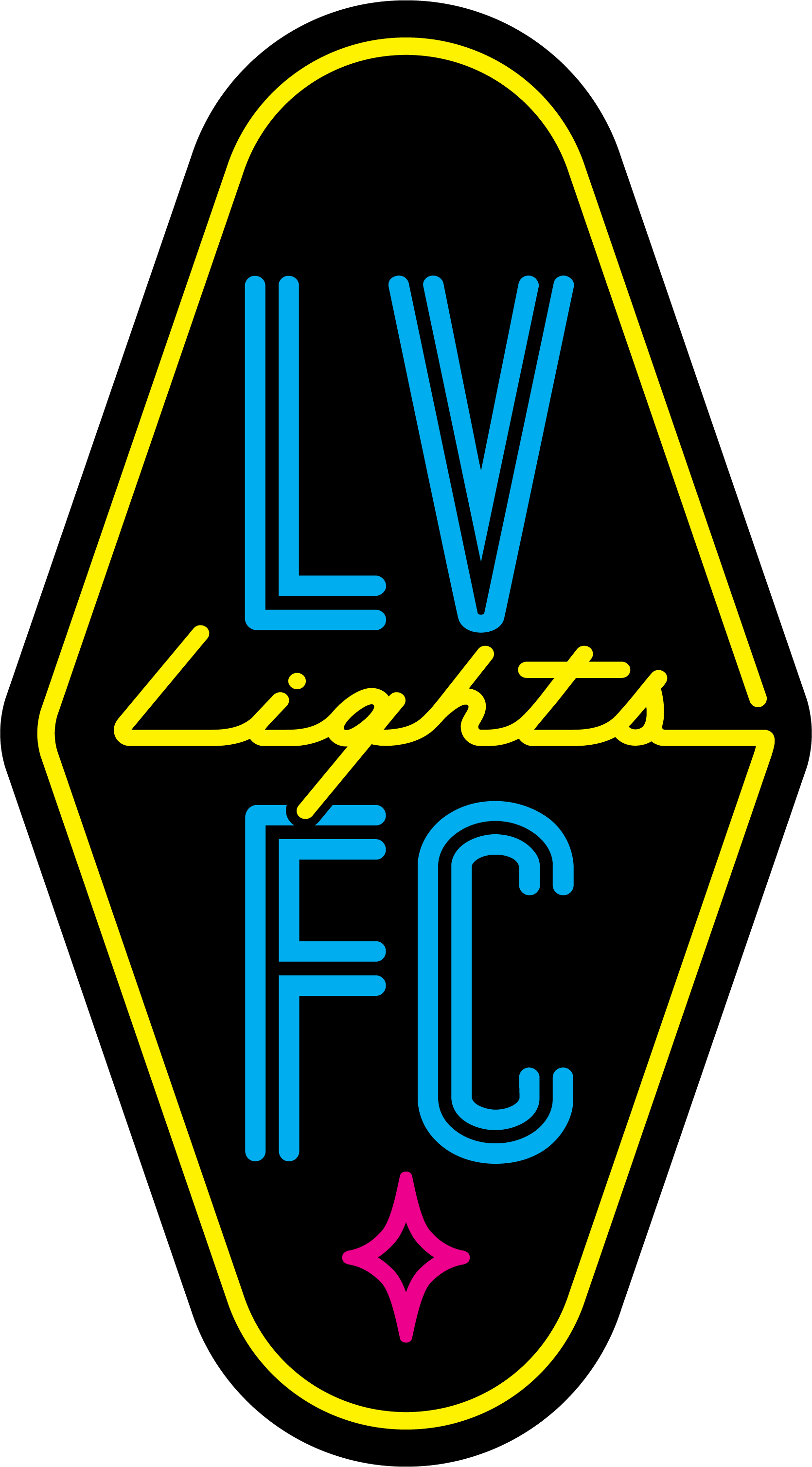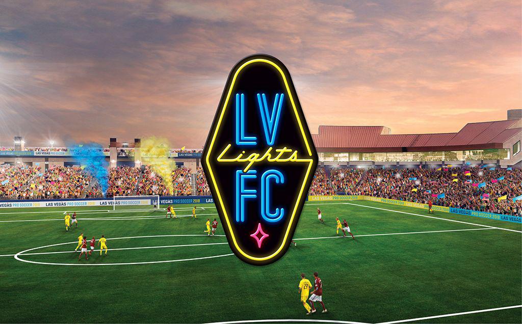
Las Vegas Lights FC has unveiled a logo that is by the fans, for the fans and of the fans, with elements inspired by hundreds of fan submissions. The result is a logo unique in many ways, capturing the essence of the city that Lights FC will represent when it begins play in the United Soccer League in February 2018.
“First and foremost, we wanted our fans and supporters in Las Vegas to lead the process of developing our official logo, and we couldn’t be more pleased with the result,” said Brett Lashbrook, team owner and CEO of Lights FC. “The logo plays into the look and feel of Las Vegas, most notably Fremont Street, right down the road from our home at Cashman Field.
The official team colors – blue, yellow and pink – are all taken from the official City of Las Vegas logo, with the neon element being a natural fit, as Lights FC will play all home games just steps from the famous Neon Museum and a few blocks from Fremont Street. The logo’s crest design shape mimics the famous “Welcome to Las Vegas” sign – rotated 90 degrees. The logo is accented with another Las Vegas signature, with the pink star at the bottom of the logo.
“We are one of the first professional sports teams in the world to fully embrace pink as one of our official team colors, but I think this just shows the type of swagger and edge that we collectively carry as a city, and our team will carry that onto the pitch every match,” Lashbrook said. “It shows that we are going to fully embrace doing things differently while also providing an authentic, exciting soccer experience to everyone who comes and watches a match at Cashman Field.”
Lights FC will begin preseason play at Cashman Field in February 2018, with a home schedule of 20-plus matches running through at least October 2018. While sharing Cashman Field during the inaugural season with the Las Vegas 51s, the stadium and playing surface will be converted to a fully natural grass playing turf to provide an intimate, authentic soccer environment for each home game.


